JoAnn gonzales

I'm an Graphic Designer based in Texas. Creating dynamic graphics for social media, digital print, and website layouts. Creating for your success is my passions. Work with me!
ABOUT ME
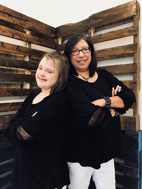
In my professional practice, colors and layouts serve as powerful tools for self-expression. When confronted with a blank canvas, I am invigorated by the prospect of crafting designs that leave a lasting impression on clients and their audience. I have a love to create with passion.
Call Me and let's create
something amazing together to captivate your audience.
Training and
work experience
Art Institute of Houston School
Associates of Science in Audio/Video Production
Udemy Online courses
Master of Graphic Design Theory
Adobe Indesign
SEO Mini Course
Embassy Church
Audio/Video Production
Media Presentations
Specializations
Design Software:
Adobe Indesign
Canva
Video Editing Software
Adobe Premier pro
Davinci Resolve
Media Presentation
Google Slides
PowerPoint
Keynote
A Glimpse into My Dazzling Portfolio"
01
Organic Oasis Farms
Social Media Post
Project Summary
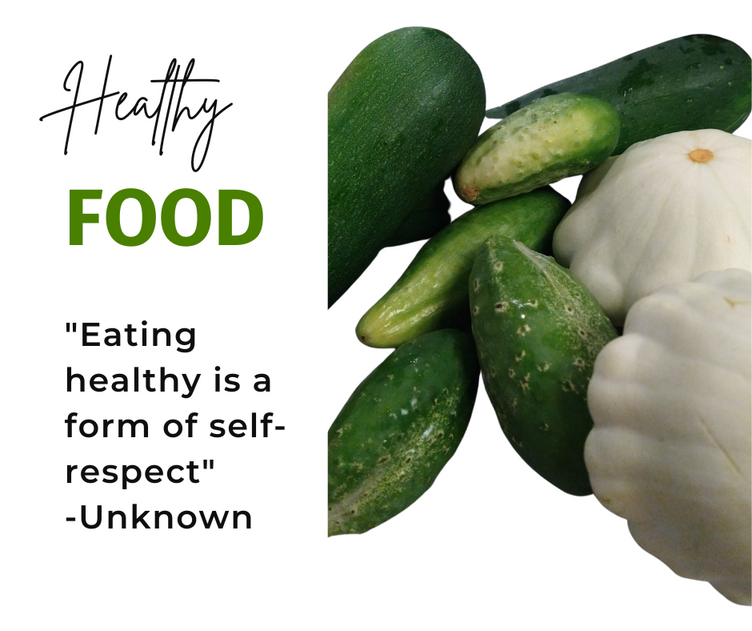
The client requested a social media post with a simple white background, complemented by a vibrant green color scheme. To ensure visual impact, I carefully selected a #4A800 color palette for the word "Food," allowing it to prominently stand out. For the Quote, I opted for a striking black text with a #0E100E color palette, creating a strong contrast against the background. To achieve a modern and clean aesthetic, I utilized the Montserrat Geometric sans-serif typeface font. This font combines quirky yet playful letterforms, seamlessly blending soft curves with sharp angles. For the word "Healthy," I chose a font that further emphasized its playfulness and retained a sense of professionalism."
02
Embassy Church
Video Editing
Project Summary
I was tasked with creating a church introduction video intended for a future live streaming program. The client provided several images for incorporation. To bring the vision to life, I utilized industry-standard software, Adobe Premiere Pro, for editing. Prior to assembling the video, I meticulously crafted each image as a storyboard using Canva software. To enhance the visual impact, I opted for the exquisite Playlist Script font, renowned for its seamless brush script style. Upon transferring the finalized storyboard to Adobe Premiere, I skillfully applied color correction techniques and seamlessly integrated background music, resulting in a polished and captivating final product."
03
Tyler publishing
Book cover page
Project Summary
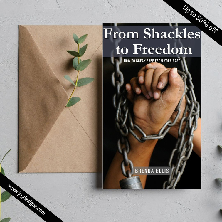
This is a story of a little girl who lived a life of sexual abuse in her past. The story also talks about how the power of God intervene and her life was completely changed. In this cover page I wanted to create how a individual lives and feels when they have been abused. The photograph also describes how this Author felt when she was going through this trial in her life. During the process of creating the title I wanted to use a serif font. The garamond font has a timeless appearance and it is used in print and digital application. For the sub-heading and Author name I went with a san-serif font to give it a modern and impactful look. I wanted to keep the book cover as a suspense as to how the ending of the story will end.
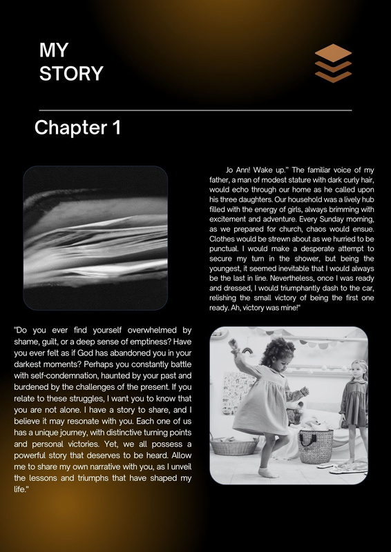
Book Layout
Project Summary
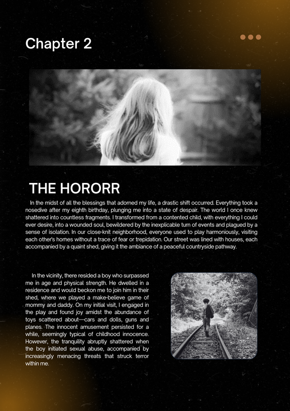
For the design of this portfolio, I opted for a box layout that exudes a contemporary feel. To enhance the visual impact, I employed a white color font with a #FAFAF4 palette against a backdrop of #000000 black. The deliberate choice of black and white colors stems from their symbolic associations with life and death rituals. Black, being a bold hue, evokes a sense of power and strength. Conversely, white represents purity and light, acting as a blank canvas for creative expression. The author specifically sought a design that would leave a lasting impression, and these contrasting colors accomplish just that.
Bread Church
Rack Card
Project Summary
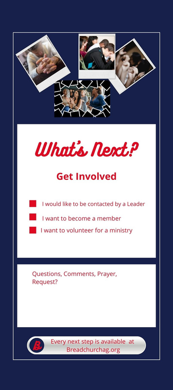
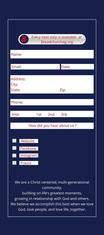
This project was developed for a local church and aimed to create a logo and rack card that aligns with the church's branding. The requested colors for the project were red and blue, which are the church's branding colors. The church specifically asked for a logo with a script font, and the chosen font was Burkhari Script. The rack card features pictures of individuals who attend the church, with the intention of fostering a personal connection with potential viewers. To make the design visually appealing, a white background was used, allowing the red text to stand out prominently.